I was looking at datasets on data.wa.gov to see what might be fun for a project, and I came across public info disclosing the amount paid to employ WA state lobbyists. It’s a very localized representation of interests attempting to influence politics and policy for our residents and lawmakers, as it represents money spent only inside Washington State.
When I first peeked at the top of the tables, I saw disclosures from “ADVANCE CHECK CASHING” in Arlington, Virginia. I didn’t expect it at first, but I began noticing quite a few other firms lobbying us are also located outside our state. Since the level to which out-of-state firms are lobbying us isn’t something I think I’ve ever heard discussed, I became more curious about what story I could illuminate through visualizing the numbers.
If you’d like to see the source code, I created a repo on GitHub: https://github.com/averyfreeman/Python_Geospatial_Data/tree/main
The charts are generated with Matplotlib, which is a popular attempt to emulate MATLAB, the uber-capable and even more expensive software with technology previously accessible only by government, engineering firms, multinational corporations, and the ultra-wealthy. The data manipulation library is called Pandas, which is somewhat analogous to Excel, but hard to imagine when considering there’s no pointing or clicking, since there’s no user interface: All the calculations are constructed 100% with code.
This system actually has its benefits: Try loading a 35,000,000 row spreadsheet and you’re likely to have a bad time – the number of observations you can manipulate in Python dwarfs the capabilities of a spreadsheet by an insurmountable margin. I even tried to load the 12,500 row dataset for this project into Libreoffice, and the first calculation I attempted crashed immediately. And additionally, even though there’s a steeper learning curve than Excel, once people get the hang of using Pandas they can be more productive, since it’s not bogged down by all that pointing and clicking.
The data I used comes from the Public Disclosure Commission, and an explanation of the things people report are listed here: https://www.pdc.wa.gov/political-disclosure-reporting-data/open-data/dataset/Lobbyist-Employers-Summary
There’s too many columns in the disclosure data to meaningful concentrate on the money coming from each state, so I immediately narrow it down to three columns. Here, you can also see that it’s a simple .csv file being read into Python:
def geospatial_map():

    our_cols = {
        'State': 'category',
        'Year': 'int',
        'Money': 'float',
    }

    clist = []
    for col in our_cols:
        clist.append(col)

    df = pd.read_csv(csvfile, dtype=our_cols, usecols=clist)
That comes out looking like this:
print(df.head())

   Year                 State      Money
0  2023  District of Columbia 497,305.43
1  2023            California 496,301.52
2  2022            California 446,805.56
3  2022  District of Columbia 437,504.86
4  2021            California 430,493.96
I haven’t tried it yet, but the dataset website, data.wa.gov, and all the sister-sites that are hosted on the same platform (basically every state, and the US government) have an API with a ton of SQL-like functions you can use while requesting the data. This is an amazingly powerful tool I am definitely going to try for my next project. You can read about their query functions here, if you’re curious: https://dev.socrata.com/docs/functions/#,
I took a pretty manual route and created my own data-narrowing and typing optimizer script, so the form it was in once I started making the charts was pretty different than its original state, but it helped to segment the process so I could focus on the visualization more than anything else once I got it to this point.
I still had to make sure the numbers columns didn’t have any non-numerical fields, though, otherwise they’d throw errors when trying to do any calculations. To avoid that pitfall, I filled them with zeros and made sure they were a datatype that would trip me up, either:
    df.rename(columns=to_rename, inplace=True)
    df['State'] = df['State'].fillna('Washington').astype('category')
    df['Year'] = df['Year'].fillna(0).astype(int)
    df['Money'] = df['Money'].fillna(0).astype(float)
Then, I wanted to make sure the states were organized by both state name and year, so I pivoted the table so states names were the index, and a column was created for each row. That single action aggregated all the money spent from each state by year, so at that point I had a single row per state name and a column for each year.
    # pivoting table aggregates values by year
    dfp = df.pivot_table(index='State', columns='Year', values='Money', observed=False, aggfunc='sum')

    # pivot creates yet more NaN - the following avoids peril
    dfp = dfp.fillna(value=0).astype(float)

    # some back-of-the-napkin calculations for going forward
    first_yr = dfp.columns[0]            #    2016
    last_yr = dfp.columns[-1]            #    2023
    total_mean = dfp.mean().mean()       # 391,133
    total_median = dfp.median().median() # 141,594
It’s easier to see it than imagine what it’d look like (the dfp rather than df variable name I created to denote df pivoted):
# here's what the pivoted table looks like:
print(dfp.head())

Year               2016         2017         2018  ...         2021         2022         2023
State                                              ...
Alabama            0.00         0.00         0.00  ...         0.00         0.00       562.50
Arizona      156,000.00   192,778.93   231,500.00  ...   264,334.00   170,300.00   205,250.00
Arkansas      94,924.50   128,594.00   121,094.00  ...   120,501.00   104,968.84   103,384.62
California 2,606,222.26 3,232,131.73 3,751,648.42  ... 5,261,021.97 5,491,396.87 6,200,283.10
Colorado     215,818.82   195,463.67   192,221.84  ...   233,031.86   289,434.81   157,109.81
Now, on to the mapping. There’s GeoJSON data on the same web site, which can deliver similar results to a shape file (in theory), but for this first project I made use of the geospatial boundary maps available from the US Census Bureau – they have a ton of neat maps located here: https://www.census.gov/geographies/mapping-files/time-series/geo/carto-boundary-file.html (I’m using cb_2018_us_state_500k )
    shape = gpd.read_file(shapefile)

    shape = pd.merge(
        left=shape,
        right=dfp,
        left_on='NAME',
        right_on='State',
        how='right'
    )
The shape file is basically just like a dataframe, it just has geographic coordinates that allow Python to use for drawing boundaries. Conveniently, the State column from the dataset, and NAME column from the shape file had the same values, so I used them to merge the two together.
         NAME LSAD         ALAND       AWATER  ...         2021         2022         2023  8 year total
0     Alabama   00  131174048583   4593327154  ...         0.00         0.00       562.50        562.50
1     Arizona   00  294198551143   1027337603  ...   264,334.00   170,300.00   205,250.00  1,818,537.93
2    Arkansas   00  134768872727   2962859592  ...   120,501.00   104,968.84   103,384.62  1,006,918.19
3  California   00  403503931312  20463871877  ... 5,261,021.97 5,491,396.87 6,200,283.10 37,839,827.01
4    Colorado   00  268422891711   1181621593  ...   233,031.86   289,434.81   157,109.81  1,961,231.65
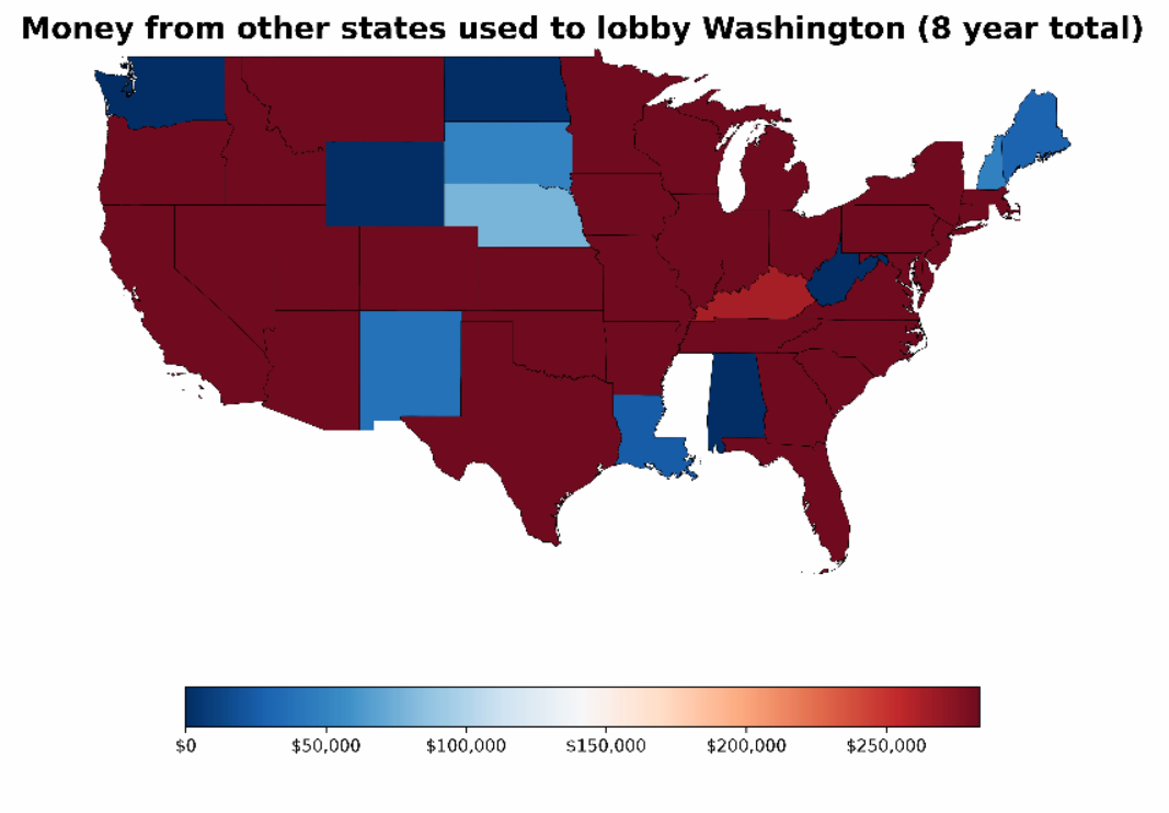
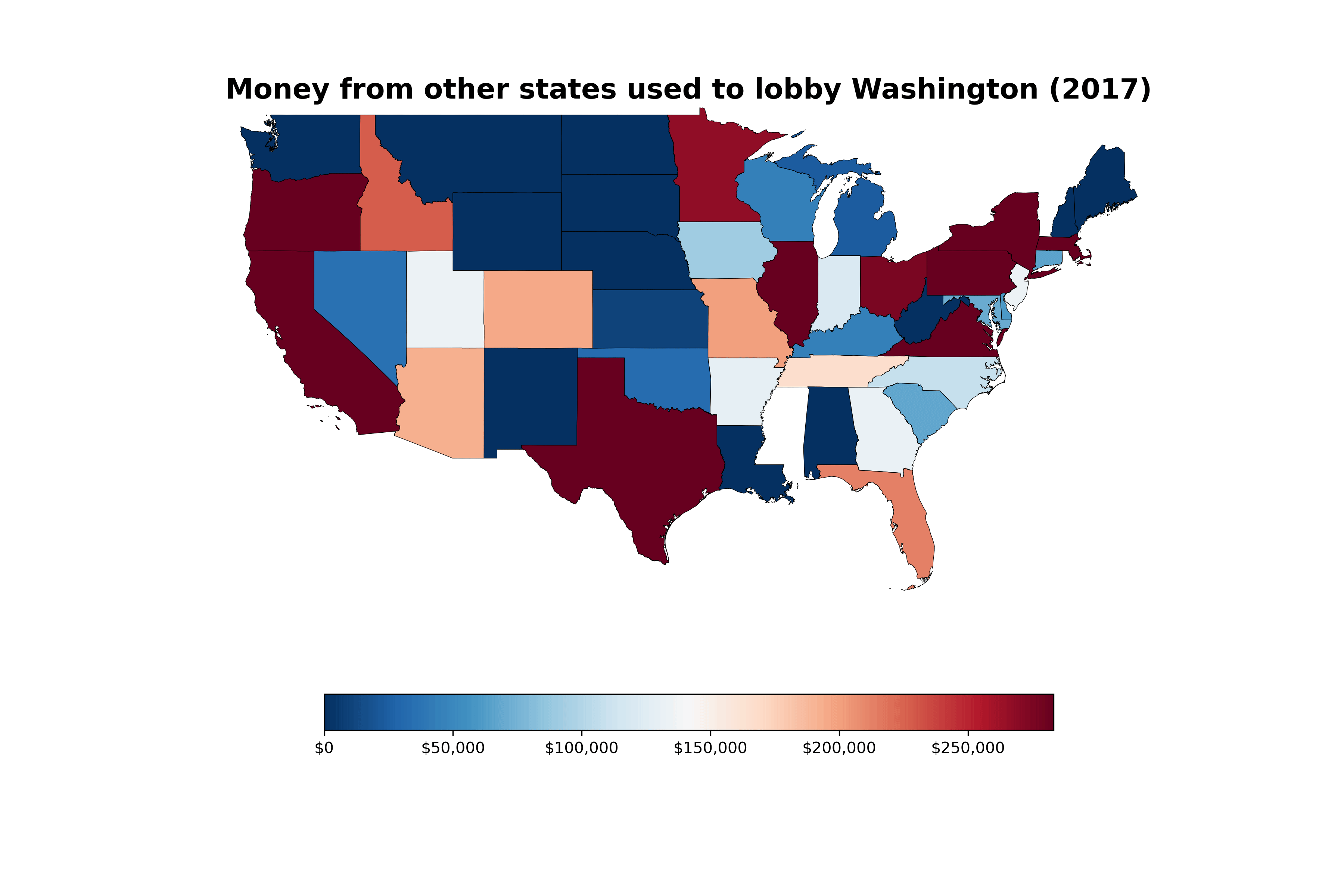
Then I animated each year’s dollar figures a frame at a time, with the 8-year aggregate calculated at the end, with the scale remaining the same to produce our dramatic finale (it’s a little contrived, but I thought it’d be fun).
At this point in the code base, it starts going from pandas (the numbers) and geopandas (the geospatial boundaries) to matplotlib (the charts/graphs/figures), and that’s where the syntax takes a big turn from familiar Python to imitation MATLAB. And it takes a bit to get used to, since it essentially has no other analog I’m familiar with (feel free to correct me in the comments below)
And it’s a very capable, powerful, language, that also happens to be quite fiddly, IMO. For example, this might sound ridiculous to anyone except people who’ve done this before, but these 4 lines are just for the legend at the bottom, with the comma_fmt line being solely responsible for commas and dollar signs (I’m not joking).
    norm = plt.Normalize(vmin=all_cols_min, vmax=upper_bounds)
    comma_fmt = FuncFormatter(lambda x, _: f'${round(x, -3):,.0f}')

    sm = plt.cm.ScalarMappable(cmap='RdBu_r', norm=norm)
    sm.set_array([])  # Only needed for adding the colorbar
    colorbar = fig.colorbar(sm, ax=ax, orientation='horizontal', shrink=0.7, format=comma_fmt)
But it’s all entertaining, nonetheless. I also did a horizontal bar-chart animation with the same data, so the dollar figures would be clear (the data from these charts perfectly correlate):
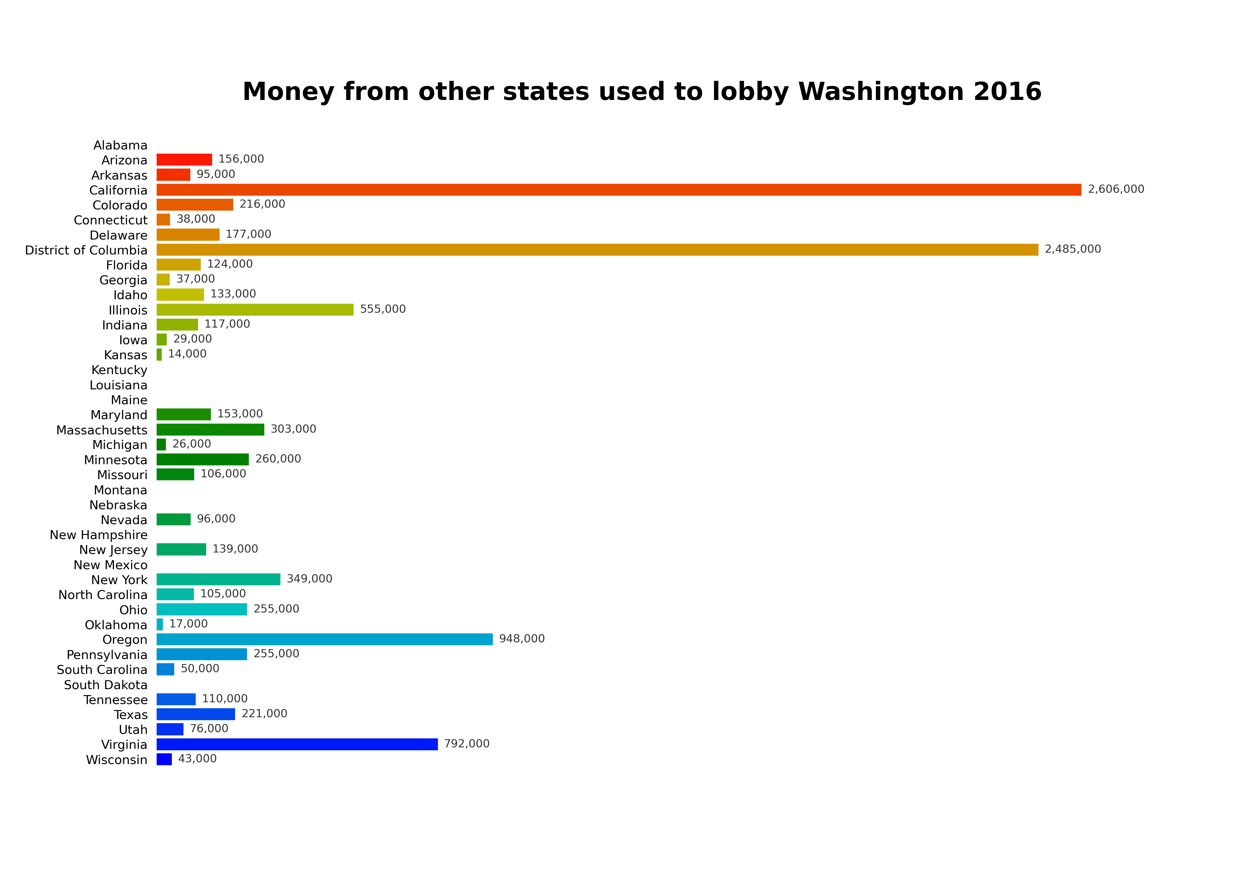
Most other states don’t have that much of an interest in Washington State politics, but there’s enough who do for it to make it interesting to see where the money is coming from. Although, I have to say, when I first charted this journey by laying eyes on a check cashing / payday loan company, it wasn’t a huge surprise.
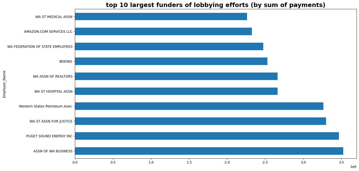
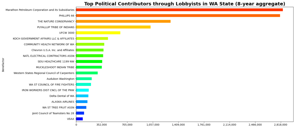
Some other interesting info has more to do with spending by entities located inside Washington state – and to be clear, spending from inside the state far outpaces spending from outside, for obvious reasons. These two graphs are part of a work in progress. They’re derived from same dataset, but with a slightly different focus: Instead of organizing these funding sources by location, they focus on names and display exactly who is hiring the lobbyists, and, perhaps more importantly, for how for much. For example, here’s the top 10 funders of lobbyists in WA by aggregate spending:
It’s been a really fun project, and I hope I have opportunities to make more of them going forward. So many things in our world are driven by data, but the numbers often don’t speak for themselves, and our ability to tell stories with data and highlight certain issues is a necessity in conveying the importance of so many salient issues of our time.
I’ll definitely be adding more as I finish other charts, and demonstrations through a jupyter notebook. I am also really anxious to try connecting the regularly updated data through the API, which I already have access to, I just have to wire up the request client – easier said than done, but I’ve been able to do it before, so I am confident I’ll be seeing more of you soon. Thanks for visiting!